
Moon
a mobile NFT marketplace
Project overview
Role
UI Researcher and Designer
Duration
September 2022
For this student project, the focus was user interface design and learning how to work with Figma. This was a great experience for me at the time, as it gave me a guided, hands-on experience working with Figma. In addition to Figma, various online resources were used for research: Khroma was used for building a color palette, Pinterest and Dribbble for design inspiration, Unsplash and Pexels for images, and Type Wolf and Type Scale were helpful when working with typography.
Background
How might we research and create a visual language that can be scaled across multiple screens based on the wireframes and flow provided from the client, ultimately delivering a style library based on the UI created and an interactive Figma prototype?
The Problem
Researching for inspiration
As with most things in creation and design, I began with research. The goal for the research phase was inspiration, getting a feel for what is out there in the NFT space and allowing it to inspire me to create a visual language. The main resources I relied on for this inspiration phase were Pinterest, Dribble, and Muzli.
I created two moodboards to capture and present the various images, typography styles, design elements, and color palettes. The moodboards were helpful in capturing what resonated with me the most. I could see quickly in one place all the varying visual elements and styles that could serve as inspiration for later design choices. They act like a playground of sorts, one with boundaries that allow for safe play and experimentation.
Moving from inspiration to design
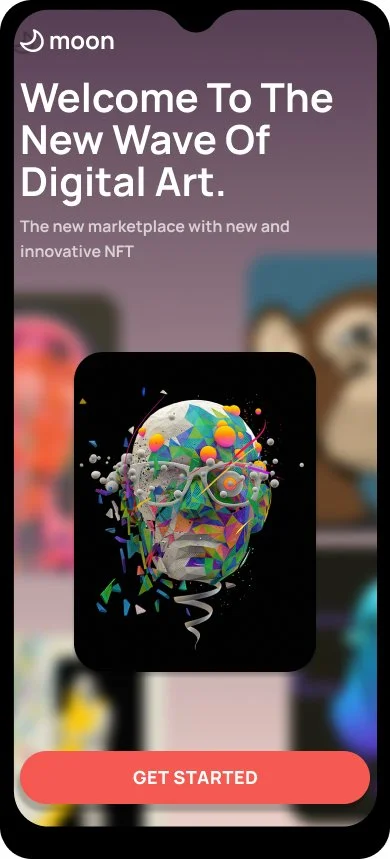
I then moved from moodboards into the next phase - visual exploration. For this phase, I created two different splash screens based on a single moodboard. While each splash screen was inspired by a single moodboard, each of the screens had their own layout, typography, color palette, and dominant imagery.
Main takeaways for research and visual exploration
At first this felt redundant — creating two splash screens after creating two optional moodboards. However, it helped me see that just because the moodboard provides some boundaries for inspiration, it does not lock one into a single pathway; design is about making inspired choices.
Furthermore, the two splash screens were useful because I was able to do basic preference testing with colleagues and friends. This was the first time getting real feedback for this project, and feedback is invaluable when creating and designing things that are intended to be used.
Scaling the design
After testing and receiving feedback, it was time to scale the design across the rest of the screens within the user flow. By applying the typography, colors, images, and components inspired by the moodboard and initial visual exploration, the screens slowly morphed from mid-fidelity wireframes into polished, high-fidelity wirescreens.
Scaling the design requires visual distinction to help the user see the various functionality, buttons, and user actions within the screens. I did this by adjusting the opacity of the colors and the weight and style of the chosen font. And once these variations were chosen and implemented, they were added to Figma as a reusable style and then to the growing UI library.

Also, working with Grids became an invaluable asset on this project. Grids allowed me to more confidently make the smaller design decisions like image placement, typography sizing, and boundary setting. The grids also became an important part of the UI library, helping future designers remain consistent as they continue to create and scale the design.
Final interactive prototype
After all the design work was complete, I began the task of linking the high fidelity wireframes together using the prototyping feature in Figma. This is a great tool that makes your designs become interactive and resemble how they would function as an app in the real world.
This project gave me some invaluable hands on experience working with the visual elements of design and one of the industry standard design programs, Figma. The project brief asked me to research and develop a visual language for a mobile NFT marketplace app, polish and scale the design of a basic user flow with five wireframes, and create an interactive Figma prototype. I was able to deliver on this request within the time allotted.
Concluding thoughts
What would I do differently?
Research — I wouldn’t spend so much time trying to design a perfect moodboard. As the project unfolded, I could see that it is just meant to serve as a starting point for inspiration.
Feedback — I wish I had the time to get more feedback from different users on this project, particularly because the NFT space is something new to me. I would have liked to interview users of apps like this to see what they are already used to.